Human-Centric Lighting
Color gamut, not just lux, shapes how bright a room looks
Two experiments at Pennsylvania State University show that light with a larger color gamut (TM-30 Rg) and less saturated reds makes a room look brighter at the same illuminance. Melanopic light, which targets the eye's daylight-sensing cells, raised brightness only at 4700 K and 40 lx and lowered it at 2800 K and 120 lx. Published in Building and Environment, November 2026.
 AI Generated
How bright a room feels is not the same as how many lux reach the desk. Wangyang Song and Dorukalp Durmus of the Department of Architectural Engineering at Pennsylvania State University (Penn State) ran two controlled experiments to find out how three properties of a light source change that impression: its color gamut, the way it renders reds, and how strongly it stimulates melanopsin, the light-sensitive pigment behind the eye's non-visual responses. Their paper is published in Building and Environment, volume 305, dated 1 November 2026.
Why this matters
Spatial brightness is the overall impression of how bright a lit space appears, and delivering enough of it is one of the main goals of architectural lighting design. In practice it is specified with illuminance and luminance. Both rest on a sensitivity curve that was derived from a small field of view and reflects only two of the eye's three cone types. As a result, two light sources that deliver the same lux can make the same room look differently bright. Correlated color temperature (CCT) does not close that gap either: the authors point to earlier studies in which CCT turned out to be a poor predictor once other factors were controlled.
Two other candidates have emerged from research. One is color gamut, meaning how saturated a light source makes colors appear. The other is melanopsin, the pigment in the intrinsically photosensitive retinal ganglion cells (ipRGCs), which drive the body clock and pupil size and may also feed into brightness perception.
The question has an energy side. If a spectrum can make a space look brighter at the same illuminance, the same visual result could be reached with less light. That is of particular interest because, according to earlier work cited by the authors, lighting designed to meet circadian recommendations can raise lighting energy use by between 10% and 100%. Until now, the authors note, studies rarely controlled gamut, red rendering and melanopic content at the same time, so their separate contributions remained unclear.
What the researchers did
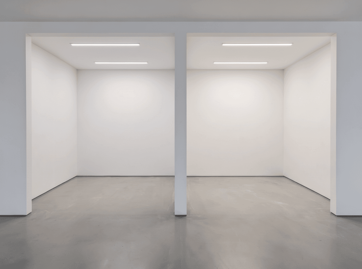
Song and Durmus carried out two psychophysical experiments, that is, experiments that measure perception by asking observers to judge carefully defined physical stimuli. According to the publicly available sections of the paper, observers were shown pairs of lighting conditions in a left and a right bay and judged which one appeared brighter.
Experiment 1: melanopic content. The first experiment varied melanopic equivalent daylight illuminance (mel-EDI). This metric expresses how strongly a light stimulates melanopsin, stated as the illuminance of standard daylight that would produce the same stimulation. Mel-EDI was tested at two CCTs, 2800 K and 4700 K, each at two levels of vertical illuminance at the eye (corneal illuminance); the abstract names 40 lx and 120 lx.
Experiment 2: color rendition. The second experiment looked at two measures from the ANSI/IES TM-30 color rendition method:
- Gamut index (Rg): the average saturation of colors under the light source compared with a reference source. Values above 100 mean colors look more saturated on average, values below 100 less saturated.
- Red chroma shift (Rcs,h1): the change in saturation for the red hues (hue-angle bin 1) only. Positive values mean reds look more vivid than under the reference, negative values mean they look duller.
Both were varied individually and in combination, while melanopic content, chromaticity (the color of the light itself) and illuminance were held constant. Differences in brightness could therefore be attributed to color rendition alone.
To check for position bias, the researchers included null trials in which both bays showed identical light. None of these produced a statistically significant difference at α = 0.05, and all pairs were counterbalanced between the left and the right bay. The study received ethics approval and was funded by the Penn State Institutes of Energy and the Environment. The number of participants and the technical details of the light sources are not part of the freely accessible material; the full text is behind the journal's paywall.
Key findings
- No uniform melanopic effect. In experiment 1, the influence of mel-EDI differed from one pair of conditions to the next. The authors describe this as "significant pair-level heterogeneity rather than a uniform effect of CCT".
- Brighter at 4700 K and 40 lx. Higher mel-EDI significantly increased perceived brightness at 4700 K and 40 lx vertical illuminance.
- Less bright at 2800 K and 120 lx. Under 2800 K at 120 lx vertical illuminance, higher mel-EDI significantly decreased perceived brightness.
- No significant effect elsewhere. The other pairs tested in experiment 1 showed no statistically significant difference.
- Larger gamut, brighter space. In experiment 2, a higher average color gamut (Rg) increased spatial brightness.
- Less red saturation, brighter space. A lower red chroma shift (Rcs,h1) also increased spatial brightness, independently of Rg.
- Gamut outweighs red. Of the two color rendition measures, average gamut had the greater influence.
The abstract does not state effect sizes, so how much brighter the spaces appeared cannot be quantified from the freely accessible material.
What it means for the lighting industry
The study adds controlled evidence that illuminance, CCT and chromaticity together still do not describe how bright a space will appear. With all three held constant in experiment 2, the color rendition properties of the spectrum changed the brightness impression. For lighting designers, this supports looking at TM-30 data beyond the fidelity index when comparing products for brightness-critical spaces.
In our view, the red result is the most interesting one for product developers. Spectra with enhanced reds are often chosen to make interiors and merchandise look more vivid. In this study, however, a larger average gamut raised perceived brightness while a stronger red chroma shift did not; the brightness benefit went with less red saturation. This suggests that a gamut increase aimed at brightness would have to come from hues other than red. That is an editorial reading of the abstract, and it should be checked against the full data before it informs a spectral design.
On melanopic content, the results caution against a simple rule. In our view, they do not support the assumption that a melanopic-rich spectrum always looks brighter and therefore allows lower illuminance: the effect was positive in one condition, negative in another and absent in the rest. Specifiers of human-centric lighting should treat any brightness benefit as dependent on CCT and light level.
The authors discuss the implications for energy efficiency and call for more accurate models of spatial brightness. The accessible material does not quantify possible energy savings, and the study alone gives no basis for changing illuminance requirements in standards. It does strengthen the case for brightness metrics that take the spectrum into account.
Limitations
The experiments were paired comparisons under controlled conditions, at two CCTs and two vertical illuminance levels. They do not show how the effects behave at other color temperatures, at higher light levels, in real occupied spaces or over longer exposure. The melanopic results were inconsistent across conditions, which limits how far they can be generalized. This summary is based on the paper's abstract, highlights and publicly available preview sections; participant numbers, effect sizes and the full statistical analysis were not accessible to us.
Citation
Song, W., Durmus, D., "Effects of lighting color gamut, red chroma shift, and melanopsin on spatial brightness", Building and Environment, Volume 305, Part B, 2026, Article 115259. DOI: 10.1016/j.buildenv.2026.115259
Authors' affiliation: Department of Architectural Engineering, Pennsylvania State University, State College, PA, USA.
Access: subscription/paywalled. © 2026 Elsevier Ltd.
Keywords of the paper: melanopsin, built environment, visual function, visual perception, chromaticity, energy efficiency.
Source: Building and Environment, https://doi.org/10.1016/j.buildenv.2026.115259 – read the original paper on ScienceDirect