LpR 44 Article: Discomfort Glare Perception of Non-Uniform Light Sources in an Office Setting
LED based luminaires with different luminance patterns and recently with increasingly non-uniform luminance patterns are becoming mainstream. This trend makes discomfort due to glare an important topic. Based on an office setting and the comparison of results from three different regions, L. M. Geerdinck, J. R. Van Gheluwe and M.C.J.M. Vissenberg from Philips Research have reviewed the currently used formulae to predict discomfort glare to ascertain if they are still valid.
Visual comfort is considered as an important quality measure for indoor functional lighting and prevention of discomfort glare is therefore essential. LED based lighting systems offer many different design options and it is no surprise that fixtures with highly non-uniform luminance patterns appear on the market nowadays. The currently used formulae to predict discomfort glare (e.g. Unified Glare Rating, UGR, or Visual Comfort Probability, VCP) are still based on conventional light sources with much more homogeneous luminance patterns. However, studies done in laboratory settings showed that point array LED luminaires may provoke more discomfort glare than uniform sources. The current study was done in an open plan office application, and was repeated at different locations (The Netherlands, China and USA). Notwithstanding minor regional differences, the main results appeared similar in the three regions. In agreement with the laboratory studies, we found that luminaires with non-uniform luminance patterns and high luminance contrasts indeed induce more discomfort glare, which cannot be predicted with UGR. A better understanding of the luminance characteristics and their effects on glare perception is essential and a redefinition of the glare index seems necessary.
Introduction
High quality lighting in offices can contribute to environmental satisfaction and individual performance, making the higher costs of investment in quality lighting worthwhile [1]. Visual comfort is considered as one of the quality measures to be relevant for indoor functional lighting with LED lighting systems [2]. One aspect of visual comfort is discomfort glare, which is the type of glare that occurs when people complain about visual discomfort from bright light sources, even without impairing vision. For indoor lighting, the assessment of discomfort glare based on the Unified Glare Rating (UGR) is widely adopted [3,4]. This rating is a function of the average luminance of the apparent surfaces of the luminaires (Ln), seen from the position of the observer (accounted for by the position index pn), with viewing angle ω, and the background luminance (Lb), as expressed in Formula 1.
![]()
Formula 1
For normal-sized luminaires with a reasonably uniform exit window luminance, UGR is a good predictor for the perception of discomfort glare. However, there is disagreement on how to evaluate glare produced by non-uniform sources. The applicability of UGR and other glare ratings for non-uniform light sources has been studied recently. It was concluded that all formulae are inappropriate to evaluate glare from non-uniform light sources [5].
With the introduction of efficient light emitting diodes (LEDs) in general lighting systems the discussion on glare from non-uniform light sources gained renewed attention. The small size and high brightness of LEDs compared to conventional fluorescent tubes enable lighting fixtures with much higher peak luminances and luminance contrasts than before. Earlier research showed that with equivalent average luminance, discomfort glare from a non-uniform stimulus seems to be greater than that of a uniform stimulus (Knoop, 2011). Most of these studies were done in a laboratory set-up where a bright light source is positioned directly in the line of sight or positioned at a single viewing angle. In a realistic situation, however, multiple light sources are mounted in the ceiling, resulting in many different angles of view of the luminaire, but typically none directly in the line of sight. Furthermore, in many commercially available LED office luminaires, the individual LEDs are not visible as a matrix of bright spots; often the light is concentrated in one or two small bright areas, surrounded by a low-brightness region. Finally, since discomfort glare can only be evaluated subjectively, the setting of the test (both the type of room and the activity of the test person) is expected to influence the glare rating. The aim of this study was therefore to examine glare perception in a representative office environment. A set of typical luminaire design parameters was varied to create relevant light settings. A first study was done in Eindhoven, The Netherlands [6]. The study was repeated in Shanghai, China and Briarcliff, USA, to investigate whether results could be reproduced in other regions.

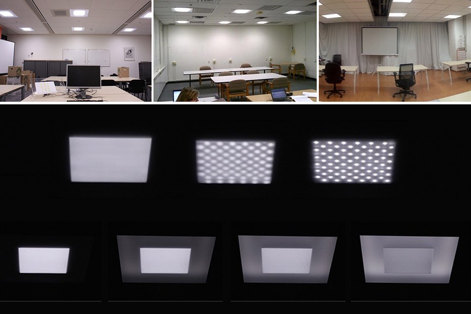
Figure 1: Pictures of the three test locations: simulated open plan office environment in Eindhoven, The Netherlands (left), Briarcliff, USA (middle) and in Shanghai, China (right)
Method
User research was performed with office employees in a simulated open plan office (see Figure 1), where 12 recessed prototype luminaires were installed. While performing simulated office tasks, participants were exposed to different, randomly offered, light settings that varied in luminance patterns of the exit window, beam shape and desk illuminance. They judged the different light settings by rating to what extent the brightness of the luminaires was acceptable, on a 6-point semantic scale (1=highly unacceptable, 2=unacceptable, 3=slightly unacceptable, 4=slightly acceptable, 5=acceptable, and 6=highly acceptable).
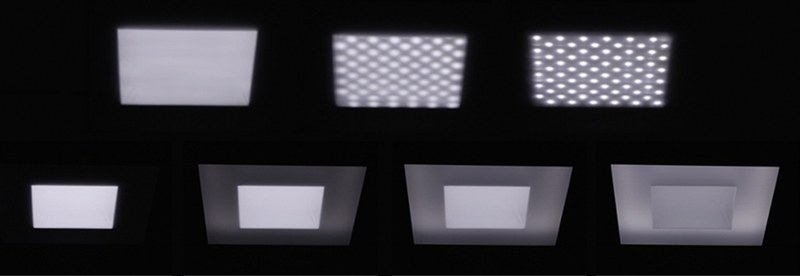
Figure 2: The different lighting patterns that were used in the investigation - (please click on the image to enlarge it)
Light Settings
In the first part of the study 30 by 30 cm luminance patterns were offered, resembling luminaires with different degrees of LED visibility, varying from ‘homogeneous’ to ‘spotty’, as illustrated in Figure 2 (top row). The maximum luminance varied from ~10 kcd/m² for the ‘homogeneous’ pattern up to ~300 kcd/m2 for the ‘spotty’ pattern. These three patterns were offered at three desk illuminance levels (Edesk = 350, 500 and 700 lux) and with two types of beam shape: ‘Lambertian’ and ‘Cut-off’ (see Figure 3).
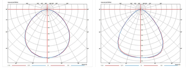
Figure 3: Polar diagrams of the two different beam shapes used. Left: broad diffuse beam (Lambertian like). Right: beam with reduced intensity at large angles (cut-off)
In the second part of the study 60 by 60 cm luminance patterns were used, resembling office luminaires consisting of the 30 by 30 cm center surrounded by a luminous rim. During the test the ratio of the luminance of the rim to that of the center was varied in 4 levels: no rim, minimal rim, middle rim and homogeneous (see Figure 2, bottom row). These patterns were offered at two task illuminances (500 and 700 lux). Finally, one setting with a spotty exit window (without a rim) was added in this second test as reference point to the ‘spotty’ setting from the first part of the test.
Results on Acceptable Brightness
Effect of spottiness
When the exit window changed from homogeneous to spotty, the acceptance of the brightness decreased. This means that glare perception increases with an increasing degree of spottiness. This cannot be derived from UGR calculations, since luminaires of the same size and intensity distribution all have the same UGR. In Figure 4 this acceptance (percentage of people) is plotted for the three different degrees of spottiness, for each region where the study was performed (Netherlands, USA and China). This decrease in acceptance is obvious for the data of Netherlands and USA. Moreover, the people in the USA seem to be more critical in general, by showing a lower acceptance compared to the results in the Netherlands. In China however, the degree of spottiness does not seem to have a large effect on the acceptance in this test situation. We do not have a clear explanation for this difference between regions.
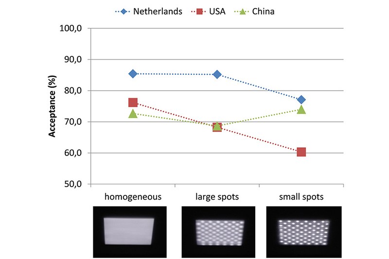
Figure 4: Acceptance of the brightness of the luminaires for three luminance patterns (homogeneous, large spots and small spots) as shown in the first part of the study, for the three different study regions (The Netherlands, USA and China)
Yet, in all regions it was found that the effect of spottiness was more pronounced for the settings with a Lambertian beam shape compared to the settings with a cut-off beam shape. This is understandable since the settings with a Lambertian beam shape have a higher intensity at the viewing angles which are more likely to cause glare (20-30 degrees in our test room) compared to the settings with a cut-off beam shape. They also exhibit the associated higher peak luminance and contrast in the exit window. We also found in all regions that the acceptance results of the 350 lux settings were systematically lower than those from the higher illuminance settings (500 and 700 lux), although the peak luminance of the spotty setting was lower and one would therefore expect less glare (and higher acceptance levels). During the study we explicitly asked for people to judge ‘the brightness of the luminaires’, but they may have weighed the darker room appearance in their judgment, by scoring these settings as less acceptable. In conclusion: especially at higher illuminance (500 -700 lux) a spotty exit window is perceived as glarier than a uniform exit window.
Effect of luminous rim
The addition of a minimal luminous rim around the 30x30 cm center (Lrim/Lcenter ≈ 1/10) resulted in an increased acceptance of the brightness, in all regions (Figure 5). This is in agreement with expectations based on UGR calculations since the addition of the rim increases the surface area of the exit window, resulting in a decreased average luminance. Increasing the rim luminance further did not improve the acceptance. The results of the test in the USA and China even seemed to show again a decrease in acceptance, especially for the setting with the same luminance of rim and center. Although we do not have a clear explanation for this result, we believe that also aesthetic aspects started to play a role, since the appearance of the aperture surface was a bit strange (not entirely uniform). People might have taken this aesthetic aspect into account when judging the ‘acceptance of the brightness of the luminaires’, by giving this setting a lower score.
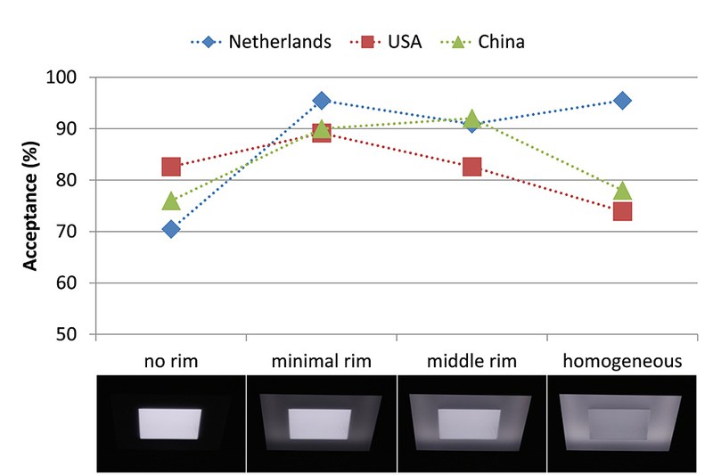
Figure 5: Acceptance of the brightness of the luminaires for four different luminance patterns (no rim, minimal rim, middle rim, homogeneous), as shown in the second part of the study, for the three different study regions (The Netherlands, USA and China) - (please click on the image to enlarge it)
We can conclude that although increasing the size of the of the luminaire exit window reduces perceived glare (in agreement with UGR), the resulting luminance of the exit window does not need to be uniform: adding a low level luminance in the rim may already be sufficient to reduce perceived glare.
Combining both spottiness and luminous rim
In the second part of the study a setting with ‘small spots’ (without rim) was also included as a reference for the first part. Figure 6 summarizes the results of the three relevant luminance patterns: the acceptance significantly increases when changing the luminance pattern from ‘small spots’ to ‘homogeneous’ and the addition of a (minimal) luminance in the rim further significantly increases this acceptance. (Geerdinck et al., 2014). These results are consistent throughout the three different regions.
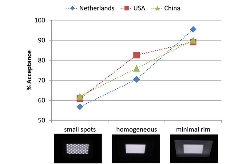
Figure 6: Acceptance of the brightness of the luminaires for three different luminance patterns (small spots, homogeneous, homogeneous with minimal rim), as shown in the second part of the study, for the three different study regions (The Netherlands, USA and China) - (please click on the image to enlarge it)
When comparing these results with the graph of the first part of the study, it can be seen that the absolute values of acceptance differ: in the first study, the acceptance of the ‘small spots’ setting is not as low as in this second part. A response bias might explain this effect: while evaluating a lighting setting people use the ‘acceptance’ scale in relation with the frame of reference, rather than as an absolute scale. In the first part of the study the ‘small spots’ setting was compared with a ‘homogeneous setting without rim’ as the most comfortable setting. But in the second part of the study, the additional rim created a much more comfortable setting, resulting in a devaluation of the ‘small spots’ rating. In future experiments one should be aware of this effect. The percentage acceptance can only be interpreted as a relative weighted number. To mitigate this effect, one should consider offering a couple of standard light sources, anchoring scenes, with a known acceptance score.
Unified Glare Rating (UGR)
For all light settings the UGR was calculated using Dialux [7], using measured luminaire intensity distributions and was found to vary between 13 and 22 (for office environments UGR<19 is recommended). In Figure 7, the UGR is plotted for each setting against the obtained data of the subjective glare rating (expressed in the percentage acceptance). The results of the first part of the study (effect of spottiness) did not show any correlation with UGR (R2 = 0.04) clearly indicating that in case of a non-uniform luminance pattern, the UGR is a bad predictor of glare perception. The results of the second part (effect of luminous rim) showed a reasonable correlation with UGR (R2=0.74). Apparently, for center-to-edge luminance variations as applied in our study (limited to contrasts lower than 1:10) the UGR still has predictive value.
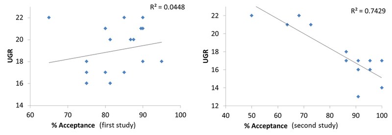
Figure 7: Calculated UGR of the different settings plotted against the percentage acceptance, for the first part of the study, effect of spottiness (left) and the second part of the study, effect of luminance rim (right) - (please click on the image to enlarge it)
Conclusion
There is a need to better understand the influence of the luminance characteristics of non-uniform luminaires on the perception of glare. To what extent do peak luminance, luminance contrast and spatial luminance distribution of non-uniform sources contribute to the increased glare perception? Since the UGR does not take into account non-uniformities, a new or modified glare index seems essential for a reliable prediction of discomfort glare.
Acknowledgements:
The authors would like to thank Meg Smith and Qian Ying Dai for their contribution in the experiments.
References:
- Veitch, J. A., Newsham, G. R., Boyce, P. R., Jones, C. C., (2007). Office lighting appraisal, performance and wellbeing: a linked mechanisms map, Proceedings of the 26th Session of the Commission Internationale de l’Eclairage, Beijing, 4 – 11 July 2007, 1-4
- Knoop, M., 2011. Lighting quality measures for interior lighting with LED lighting systems, Conference proceedings of the 27th session of the CIE, Sun City, 10 - 15 July 2011, 219-225
- Commission Internationale de l'Eclairage (CIE). (1983). Discomfort glare in the interior working environment, Publication No. 55-1983
- Commission Internationale de l'Eclairage (CIE). (1995). Discomfort glare in interior lighting, CIE Publication No. 117- 1995, Vienna, Austria
- Cai, H., Chung, T. (2012). Evaluating discomfort glare from non-uniform electric light sources, Lighting Research Technology, 0, 1-28
- Geerdinck, L.M., Van Gheluwe, J.R., Vissenberg, M.C.J.M., 2014. Discomfort glare perception of non-uniform light sources in an office setting. Accepted manuscript submitted for publication in special edition (Light & Lighting Design) of Journal of Environmental Psychology, April 2014.
- www.DIAL.de
